
AWT (Abstract Window Toolkit)
AWT (Abstract Window Toolkit)
Java AWT (Abstract Window Toolkit) is an API to develop GUI or window-based applications in java.
Java AWT components are platform-dependent i.e. components are displayed according to the view of operating system. AWT is heavyweight i.e. its components are using the resources of OS.
AWT Packages
AWT is huge! It consists of 12 packages of 370 classes (Swing is even bigger, with 18 packages of 737 classes as of JDK 1.8). Fortunately, only 2 packages - java.awt and java.awt.event - are commonly-used.
The java.awt package contains the core AWT graphics classes:
GUI Container classes, such as Frame and Panel,
Layout managers, such as FlowLayout, BorderLayout and GridLayout,
Custom graphics classes, such as Graphics, Color and Font.
The java.awt.event package supports event handling:
Event classes, such as ActionEvent, MouseEvent, KeyEvent and WindowEvent,
Event Listener Interfaces, such as ActionListener, MouseListener, KeyListener and WindowListener,
Event Listener Adapter classes, such as MouseAdapter, KeyAdapter, and WindowAdapter.
Event and Listener (Java Event Handling)
Java Event classes and Listener interfaces

Steps to perform Event Handling
Following steps are required to perform event handling:
Register the component with the Listener
Registration Methods
For registering the component with the Listener, many classes provide the registration methods. For example:
Button
public void addActionListener(ActionListener a){}
MenuItem
public void addActionListener(ActionListener a){}
TextField
public void addActionListener(ActionListener a){}
public void addTextListener(TextListener a){}
TextArea
public void addTextListener(TextListener a){}
Checkbox
public void addItemListener(ItemListener a){}
Choice
public void addItemListener(ItemListener a){}
List
public void addActionListener(ActionListener a){}
public void addItemListener(ItemListener a){}
Java LayoutManagers
The LayoutManagers are used to arrange components in a particular manner. LayoutManager is an interface that is implemented by all the classes of layout managers. There are following classes that represents the layout managers:
java.awt.FlowLayout
java.awt.BorderLayout
java.awt.GridLayout
java.awt.GridBagLayout
java.awt.CardLayout
Java FlowLayout
The FlowLayout is used to arrange the components in a line, one after another (in a flow). It is the default layout of applet or panel.
Fields of FlowLayout class
public static final int LEFT
public static final int RIGHT
public static final int CENTER
public static final int LEADING
public static final int TRAILING
Constructors of FlowLayout class
FlowLayout(): creates a flow layout with centered alignment and a default 5 unit horizontal and vertical gap.
FlowLayout(int align, int hgap, int vgap): creates a flow layout with the given alignment and the given horizontal and vertical gap.
import java.awt.*;
import java.applet.*;
/*<applet code=FlowDemo width=400 height=500></applet>*/
public class FlowDemo extends Applet
{
Button b1,b2,b3,b4;
Label l;
public void init()
{
setLayout(new FlowLayout());
l=new Label("Hii I'm Label");
b1 = new Button("One");
b2= new Button("Two");
b3 = new Button("Three");
b4 = new Button("Four");
add(b1);
add(b2);
add(l);
add(b3);
add(b4);
}
}
Java BorderLayout
The BorderLayout is used to arrange the components in five regions: north, south, east, west and center. Each region (area) may contain one component only. It is the default layout of frame or window. The BorderLayout provides five constants for each region:
public static final int NORTH
public static final int SOUTH
public static final int EAST
public static final int WEST
public static final int CENTER
Constructors of BorderLayout class:
BorderLayout(): creates a border layout but with no gaps between the components.

import java.awt.*;
import java.applet.*;
/*<applet code=BorderDemo width=400 height=500></applet>*/
public class BorderDemo extends Applet
{
Button b1,b2,b3,b4;
TextField t;
public void init()
{
setLayout(new BorderLayout());
t=new TextField(40);
b1 = new Button("One");
b2= new Button("Two");
b3 = new Button("Three");
b4 = new Button("Four");
add(b1,BorderLayout.SOUTH);
add(b2,BorderLayout.NORTH);
add(t,BorderLayout.CENTER);
add(b3,BorderLayout.EAST);
add(b4,BorderLayout.WEST);
}
}
Java GridLayout:
The GridLayout is used to arrange the components in rectangular grid. One component is displayed in each rectangle.
Constructors of GridLayout class
GridLayout(): creates a grid layout with one column per component in a row.
GridLayout(int rows, int columns, int hgap, int vgap): creates a grid layout with the given rows and columns alongwith given horizontal and vertical gaps.
import java.awt.*;
import java.applet.*;
/*<applet code=GridDemo width=400 height=500></applet>*/
public class GridDemo extends Applet
{
Button b1,b2,b3,b4;
TextField t1,t2;
Label l1,l2;
public void init()
{
setLayout(new GridLayout(3,3));
l1=new Label("Enter First number");
t1=new TextField(20);
l2=new Label("Enter second number");
t2=new TextField(20);
b1 = new Button("+");
b2= new Button("-");
b3 = new Button("*");
b4 = new Button("/");
add(l1);
add(t1);
add(l2);
add(t2);
add(b1);
add(b2);
add(b3);
add(b4);
}
}
Java GridBagLayout
The Java GridBagLayout class is used to align components vertically, horizontally or along their baseline.
The components may not be of same size. Each GridBagLayout object maintains a dynamic, rectangular grid of cells. Each component occupies one or more cells known as its display area. Each component associates an instance of GridBagConstraints. With the help of constraints object we arrange component's display area on the grid. The GridBagLayout manages each component's minimum and preferred sizes in order to determine component's size.
You can set the following GridBagConstraints instance variables:
gridx, gridy
Specify the row and column at the upper left of the component. The leftmost column has address gridx=0 and the top row has address gridy=0.
ipadx, ipady
Specifies the internal padding: how much to add to the size of the component. The default value is zero. The width of the component will be at least its minimum width plus ipadx*2 pixels, since the padding applies to both sides of the component. Similarly, the height of the component will be at least its minimum height plus ipady*2 pixels.
gridwidth, gridheight
Specify the number of columns (for gridwidth) or rows (for gridheight) in the component's display area. These constraints specify the number of cells the component uses, not the number of pixels it uses. The default value is 1.
Note: GridBagLayout does not allow components to span multiple rows unless the component is in the leftmost column or you have specified positive gridx and gridy values for the component.
weightx, weighty
Specifying weights is an art that can have a significant impact on the appearance of the components a GridBagLayout controls. Weights are used to determine how to distribute space among columns (weightx) and among rows (weighty); this is important for specifying resizing behavior.
Unless you specify at least one non-zero value for weightx or weighty, all the components clump together in the center of their container. This is because when the weight is 0.0 (the default), the GridBagLayout puts any extra space between its grid of cells and the edges of the container.
Generally weights are specified with 0.0 and 1.0 as the extremes: the numbers in between are used as necessary. Larger numbers indicate that the component's row or column should get more space. For each column, the weight is related to the highest weightxspecified for a component within that column, with each multicolumn component's weight being split somehow between the columns the component is in. Similarly, each row's weight is related to the highest weighty specified for a component within that row. Extra space tends to go toward the rightmost column and bottom row.
fill
Used when the component's display area is larger than the component's requested size to determine whether and how to resize the component. Valid values (defined as GridBagConstraints constants) include NONE (the default), HORIZONTAL (make the component wide enough to fill its display area horizontally, but do not change its height), VERTICAL (make the component tall enough to fill its display area vertically, but do not change its width), and BOTH (make the component fill its display area entirely).
insets
Specifies the external padding of the component -- the minimum amount of space between the component and the edges of its display area. The value is specified as an Insets object. By default, each component has no external padding.
anchor
Used when the component is smaller than its display area to determine where (within the area) to place the component. Valid values (defined as GridBagConstraints constants) are CENTER (the default), PAGE_START, PAGE_END, LINE_START,LINE_END, FIRST_LINE_START, FIRST_LINE_END, LAST_LINE_END, and LAST_LINE_START.
import java.awt.*;
import java.applet.*;
/*<applet code=GridBagDemo width=400 height=500></applet>*/
public class GridBagDemo extends Applet
{
public void init()
{
GridBagConstraints gbc = new GridBagConstraints();
setLayout(new GridBagLayout());
gbc.fill = GridBagConstraints.HORIZONTAL;
gbc.gridx = 0;
gbc.gridy = 0;
//gbc.weightx=1.0;
add(new Button("Button One"), gbc);
gbc.gridx = 1;
gbc.gridy = 0;
gbc.weighty=0.9;
add(new Button("Button two"), gbc);
gbc.fill = GridBagConstraints.HORIZONTAL;
gbc.ipady = 20;
gbc.gridx = 0;
gbc.gridy = 1;
add(new Button("Button Three"), gbc);
gbc.gridx = 1;
gbc.gridy = 1;
// gbc.insets = new Insets(10,10,10,10);
add(new Button("Button Four"), gbc);
gbc.fill = GridBagConstraints.HORIZONTAL;
gbc.gridx = 0;
gbc.gridy = 2;
gbc.gridwidth = 2;
gbc.ipady = 40;
add(new Button("Button Five"), gbc);
}
}
Java CardLayout
The CardLayout class manages the components in such a manner that only one component is visible at a time. It treats each component as a card that is why it is known as CardLayout.
Constructors of CardLayout class
CardLayout(): creates a card layout with zero horizontal and vertical gap.
Commonly used methods of CardLayout class
public void next(Container parent): is used to flip to the next card of the given container.
public void first(Container parent): is used to flip to the first card of the given container.
public void show(Container parent, String name): is used to flip to the specified card with the given name.
Java AWT Hierarchy
The hierarchy of Java AWT classes are given below.

Containers and Components

There are two types of GUI elements:
Component: Components are elementary GUI entities, such as Button, Label, and TextField etc.
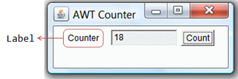
In the above figure, there are three containers: a Frame and two Panels. A Frame is the top-level container of an AWT program. A Frame has a title bar (containing an icon, a title, and the minimize/maximize/close buttons), an optional menu bar and the content display area. A Panel is a rectangular area used to group related GUI components in a certain layout. In the above figure, the top-level Frame contains two Panels. There are five components: a Label (providing description), a TextField (for users to enter text), and three Buttons (for user to trigger certain programmed actions).
Top-Level Containers: Frame, Dialog and Applet
Each GUI program has a top-level container. The commonly-used top-level containers in AWT are Frame, Dialog and Applet:

A Frame provides the "main window" for the GUI application, which has a title bar (containing an icon, a title, the minimize, maximize/restore-down and close buttons), an optional menu bar, and the content display area. To write a GUI program, we typically start with a subclass extending fromjava.awt.Frame to inherit the main window as follows:
An AWT Dialog is a "pop-up window" used for interacting with the users. A Dialog has a title-bar (containing an icon, a title and a close button) and a content display area, as illustrated.
Secondary Containers: Panel and ScrollPane
Secondary containers are placed inside a top-level container or another secondary container. AWT also provide these secondary containers:
Panel: a rectangular box under a higher-level container, used to layout a set of related GUI components in pattern such as grid or flow.
import java.applet.*;
import java.awt.*;
Example of Applet:
/*<applet code=MyApplet width=200 height=200 ></applet>*/
public class MyApplet extends Applet
{
public void init()
{
setBackground(Color.green);
}
public void start()
{
System.out.println("Applet started");
}
public void paint(Graphics g)
{
g.drawString("Hello from Java!", 60, 100);
System.out.println("Hey!! I'm in paint");
}
public void stop()
{
System.out.println("Stop called..");
}
public void destroy()
{
System.out.println("Applet destroyed");
}
}
How to run?
Open command prompt , change to current working directory and type:
javac MyApplet.java
appletviewer MyApplet.java
Example of Frame:
import java.awt.*;
public class FrameDemo extends Frame
{
public FrameDemo()
{
setTitle("Frame Demo");
setSize(250, 120);
setVisible(true);
}
public static void main(String[] args)
{
new FrameDemo() ;
}
}
How to run?
Open command prompt , change to current working directory and type:
javac FrameDemo.java
java FrameDemo
AWT Component Classes
AWT provides many ready-made and reusable GUI components in package java.awt. The frequently-used are: Button, TextField, Label, Checkbox, CheckboxGroup (radio buttons), List, and Choice, as illustrated below.

Useful Methods of Component class
AWT GUI Components:
java.awt.Label
A java.awt.Label provides a descriptive text string. Take note that System.out.println() prints to the system console, NOT to the graphics screen. You could use a Label to label another component (such as text field) or provide a text description.
Constructors and Methods
java.awt.Button
A java.awt.Button is a GUI component that triggers a certain programmed action upon clicking.
Button Constructors and Methods
// Demonstrate Buttons
import java.awt.*;
import java.awt.event.*;
import java.applet.*;
/*<applet code="ButtonDemo" width=250 height=150>
</applet>*/
public class ButtonDemo extends Applet implements ActionListener
{
String msg = "";
Label lbl;
Button yes, no, maybe;
public void init()
{
lbl=new Label();
yes = new Button("Yes");
no = new Button("No");
maybe = new Button("Undecided");
add(yes);
add(no);
add(maybe);
add(lbl);
yes.addActionListener(this);
no.addActionListener(this);
maybe.addActionListener(this);
}
public void actionPerformed(ActionEvent ae)
{
String str = ae.getActionCommand();
if(str.equals("Yes"))
{
msg = "You pressed Yes.";
}
else if(str.equals("No"))
{
msg = "You pressed No.";
}
else
{
msg = "You pressed undecided.";
}
lbl.setText(msg);
}
}
java.awt.TextField
Text Areas and Text Fields
Text components are components that store and display text which can be selected and altered. Text components support a number of features including text insertion, editing, selection, and deletion.
The text component classes are subclasses of the TextComponent class, which defines attributes and behavior that is applicable to all text components. The TextComponent class supports text selection, caret positioning, text setting, and toggling of the component's editable state because these features are common to both text fields and text areas.
TextArea Class Constructors and Methods
TextField Class Constructors and Methods
import java.awt.*;
import java.applet.*;
/*<applet code=TextfieldDemo width=200 height=200></applet>*/
public class TextfieldDemo extends Applet
{
public void init()
{
TextField t1 = new TextField();
TextField t2 = new TextField(40);
TextField t3 = new TextField("I'm Textfield");
t2.setEchoChar('$');
TextArea ta=new TextArea(10,20);
// add labels to applet window
add(t1);
add(t2);
add(t3);
add(ta);
}
}
Check Boxes
A check box is a component that can be either on or off, that is, either selected or not. You toggle a check box's state by clicking on it.
Checkbox Constructors and Methods
// Demonstrate check boxes.
import java.applet.*;
import java.awt.*;
import java.awt.event.*;
/*<applet code=CheckboxDemo width=800 height=800></applet>*/
public class CheckboxDemo extends Applet implements ItemListener
{
Label l;
Checkbox c1, c2, c3, c4;
String s="U selected ";
public void init()
{
setLayout(new FlowLayout());
l=new Label();
c1 = new Checkbox("Windows 98/XP", true);
c2 = new Checkbox("Windows NT/2000");
c3 = new Checkbox("Mac");
c4 = new Checkbox("Solaris OS");
add(l);
add(c1);
add(c2);
add(c3);
add(c4);
c1.addItemListener(this);
c2.addItemListener(this);
c3.addItemListener(this);
c4.addItemListener(this);
}
public void itemStateChanged(ItemEvent e)
{
if(c1.getState())
s+=c1.getLabel();
if(c2.getState())
s+=","+c2.getLabel();
if(c3.getState())
s+=","+c3.getLabel();
if(c4.getState())
s+=","+c4.getLabel();
l.setText(s);
}
}
CheckboxGroup class
The CheckboxGroup class is used to group the set of checkbox.
Constructors and Methods
import java.applet.*;
import java.awt.*;
import java.awt.event.*;
/*<applet code=CheckboxGroupDemo2 width=200 height=200></applet>*/
public class CheckboxGroupDemo2 extends Applet implements ItemListener
{
Label l;
Checkbox c1, c2, c3, c4;
CheckboxGroup cbg;
public void init()
{
l=new Label("Good Morning SYCS...Jag Jaaooo!!!");
cbg = new CheckboxGroup();
c1 = new Checkbox("Bold", cbg, true);
c2 = new Checkbox("Italic", cbg, false);
c3 = new Checkbox("Plain", cbg, false);
c4 = new Checkbox("Bold+Italic", cbg, false);
add(l);
add(c1);
add(c2);
add(c3);
add(c4);
c1.addItemListener(this);
c2.addItemListener(this);
c3.addItemListener(this);
c4.addItemListener(this);
}
public void itemStateChanged(ItemEvent e)
{
if(cbg.getSelectedCheckbox()==c1)
l.setFont(new Font("Arial",Font.BOLD,18));
else if(cbg.getSelectedCheckbox()==c2)
l.setFont(new Font("Arial",Font.ITALIC,20));
else if(cbg.getSelectedCheckbox()==c3)
l.setFont(new Font("Arial",Font.PLAIN,16));
else if(cbg.getSelectedCheckbox()==c4)
l.setFont(new Font("Arial",Font.BOLD|Font.ITALIC,22));
}
}
Choices
The Choice class gives you a way to create a pop-up menu of selections. A choice component looks somewhat like a button, but has a distinctive face. Clicking on a choice component drops down a type of menu (in appearance, but not the same as a real menu). You can select one of the elements in the choice object.
Choice Class Constructors and Methods
// Demonstrate Choice lists.
import java.awt.*;
import java.awt.event.*;
import java.applet.*;
/*<applet code=ChoiceDemo width=200 height=200></applet>*/
public class ChoiceDemo extends Applet implements ItemListener
{
Choice os, browser;
String msg = "";
public void init()
{
os = new Choice();
browser = new Choice();
os.add("Windows 98/XP");
os.add("Windows NT/2000");
os.add("Solaris");
os.add("MacOS");
browser.add("Netscape");
browser.add("Chrome");
browser.add("Internet Explorer");
browser.select("Firefox");
add(os);
add(browser);
os.addItemListener(this);
browser.addItemListener(this);
}
public void itemStateChanged(ItemEvent ie)
{
repaint();
}
public void paint(Graphics g)
{
msg = "Current OS: ";
msg += os.getSelectedItem();
g.drawString(msg, 6, 120);
msg = "Current Browser: ";
msg += browser.getSelectedItem();
g.drawString(msg, 6, 140);
}
}
Lists
Lists are groups of items that are formatted inside of a kind of scrolling pane. The list can be scrolled up and down in order to see all its elements. The list gives you a window in which to view some subset of the list elements.
Lists can be single selection or multiple selection, which means, respectively, that only one, or multiple items can be selected simultaneously. Selected elements can be retrieved from a list component and used for various purposes by your application.
List Constructors and Methods
// Demonstrate Choice lists.
import java.awt.*;
import java.awt.event.*;
import java.applet.*;
/*<applet code=ListDemo width=200 height=200></applet>*/
public class ListDemo extends Applet implements ActionListener
{
List langs,os;
String msg = "";
public void init()
{
langs = new List(2 , true);
os = new List(3, false);
langs.add("C");
langs.add("C++");
langs.add("Java");
langs.add(".Net");
os.add("Windows");
os.add("Linux");
os.add("Mac");
os.select(1);
add(langs);
add(os);
langs.addActionListener(this);
os.addActionListener(this);
}
public void actionPerformed(ActionEvent ae)
{
repaint();
}
public void paint(Graphics g)
{
int indx[];
msg = "Current Languages: ";
indx = langs.getSelectedIndexes();
for(int i=0; i<indx.length; i++)
msg += langs.getItem(indx[i]) + " ";
g.drawString(msg, 6, 120);
msg = "Current OS: ";
msg += os.getSelectedItem();
g.drawString(msg, 6, 140);
}
}
Menus
Menus are elements that are included as members of menu bars. A menu bar can be placed on a frame. The frame manages its location and layout.
Menus display a list of member menu items when clicked. Selecting the menu item usually results in some action performed by the application. These components behave as their counterparts in other window programming environments.
Menus contain menu items. These two elements are defined by the Menu and MenuItem classes. Menu bars are defined by the MenuBar class.
Menu items can be either simple labels, separators--simply horizontal lines that separate menu items--or other menus.
Menu Class Constructors and Methods
Menus support adding, removing, and inserting menu items that include other menus and separators that help make the menus more readable. You can define a menu to be a "tear-off" menu, which means it will be rendered in a window detached from the frame that contains the menu bar to which the menu belongs.
MenuItem Constructors and Methods
Most of the behavior that you will use is defined in the Menu and MenuItem classes. However, theMenuComponent class defines the common behavior for all menu related types, includingMenuBars.
MenuBar Class Constructors and Methods
import java.awt.*;
import java.awt.event.*;
import java.util.*;
public class MenusDemo extends Frame implements ActionListener
{
TextArea ta;
MenuBar mb;
Menu file,format;
MenuItem blnk,exit,d,b,i,p;
public MenusDemo()
{
mb = new MenuBar();
file = new Menu("File");
format = new Menu("Format");
blnk = new MenuItem("New");
d= new MenuItem("Date");
exit = new MenuItem("Exit");
b = new MenuItem("Bold");
i = new MenuItem("Italic");
p = new MenuItem("Plain");
ta = new TextArea(10, 40);
ta.setBackground(Color.pink);
file.add(blnk);
file.add(d);
file.addSeparator();
file.add(exit);
format.add(b);
format.add(i);
format.add(p);
mb.add(file);
mb.add(format);
setMenuBar(mb);
blnk.addActionListener(this);
d.addActionListener(this);
exit.addActionListener(this);
b.addActionListener(this);
i.addActionListener(this);
p.addActionListener(this);
add(ta);
setVisible(true);
setTitle("Menu Practice");
setSize(400, 400);
}
public void actionPerformed(ActionEvent ae)
{
if(ae.getSource()==blnk)
ta.setText(" ");
else if(ae.getSource()==d)
ta.setText("Date is "+new Date());
else if(ae.getSource()==exit)
System.exit(0);
else if(ae.getSource()==b)
ta.setFont(new Font("Verdana",Font.BOLD,20));
else if(ae.getSource()==i)
ta.setFont(new Font("Arial",Font.ITALIC,25));
else if(ae.getSource()==p)
ta.setFont(new Font("Arial",Font.PLAIN,22));
}
Java AWT components are platform-dependent i.e. components are displayed according to the view of operating system. AWT is heavyweight i.e. its components are using the resources of OS.
AWT Packages
AWT is huge! It consists of 12 packages of 370 classes (Swing is even bigger, with 18 packages of 737 classes as of JDK 1.8). Fortunately, only 2 packages - java.awt and java.awt.event - are commonly-used.
The java.awt package contains the core AWT graphics classes:
GUI Component classes, such as Button, TextField, and Label,
GUI Container classes, such as Frame and Panel,
Layout managers, such as FlowLayout, BorderLayout and GridLayout,
Custom graphics classes, such as Graphics, Color and Font.
The java.awt.event package supports event handling:
Event classes, such as ActionEvent, MouseEvent, KeyEvent and WindowEvent,
Event Listener Interfaces, such as ActionListener, MouseListener, KeyListener and WindowListener,
Event Listener Adapter classes, such as MouseAdapter, KeyAdapter, and WindowAdapter.
Event and Listener (Java Event Handling)
Following steps are required to perform event handling:
Register the component with the Listener
Registration Methods
For registering the component with the Listener, many classes provide the registration methods. For example:
Button
public void addActionListener(ActionListener a){}
MenuItem
public void addActionListener(ActionListener a){}
TextField
public void addActionListener(ActionListener a){}
public void addTextListener(TextListener a){}
TextArea
public void addTextListener(TextListener a){}
Checkbox
public void addItemListener(ItemListener a){}
Choice
public void addItemListener(ItemListener a){}
List
public void addActionListener(ActionListener a){}
public void addItemListener(ItemListener a){}
Java LayoutManagers
The LayoutManagers are used to arrange components in a particular manner. LayoutManager is an interface that is implemented by all the classes of layout managers. There are following classes that represents the layout managers:
java.awt.FlowLayout
java.awt.BorderLayout
java.awt.GridLayout
java.awt.GridBagLayout
java.awt.CardLayout
Java FlowLayout
The FlowLayout is used to arrange the components in a line, one after another (in a flow). It is the default layout of applet or panel.
Fields of FlowLayout class
public static final int LEFT
public static final int RIGHT
public static final int CENTER
public static final int LEADING
public static final int TRAILING
Constructors of FlowLayout class
FlowLayout(): creates a flow layout with centered alignment and a default 5 unit horizontal and vertical gap.
FlowLayout(int align): creates a flow layout with the given alignment and a default 5 unit horizontal and vertical gap.
FlowLayout(int align, int hgap, int vgap): creates a flow layout with the given alignment and the given horizontal and vertical gap.
import java.awt.*;
import java.applet.*;
/*<applet code=FlowDemo width=400 height=500></applet>*/
public class FlowDemo extends Applet
{
Button b1,b2,b3,b4;
Label l;
public void init()
{
setLayout(new FlowLayout());
l=new Label("Hii I'm Label");
b1 = new Button("One");
b2= new Button("Two");
b3 = new Button("Three");
b4 = new Button("Four");
add(b1);
add(b2);
add(l);
add(b3);
add(b4);
}
}
Java BorderLayout
The BorderLayout is used to arrange the components in five regions: north, south, east, west and center. Each region (area) may contain one component only. It is the default layout of frame or window. The BorderLayout provides five constants for each region:
public static final int NORTH
public static final int SOUTH
public static final int EAST
public static final int WEST
public static final int CENTER
Constructors of BorderLayout class:
BorderLayout(): creates a border layout but with no gaps between the components.
JBorderLayout(int hgap, int vgap): creates a border layout with the given horizontal and vertical gaps between the components.
import java.awt.*;
import java.applet.*;
/*<applet code=BorderDemo width=400 height=500></applet>*/
public class BorderDemo extends Applet
{
Button b1,b2,b3,b4;
TextField t;
public void init()
{
setLayout(new BorderLayout());
t=new TextField(40);
b1 = new Button("One");
b2= new Button("Two");
b3 = new Button("Three");
b4 = new Button("Four");
add(b1,BorderLayout.SOUTH);
add(b2,BorderLayout.NORTH);
add(t,BorderLayout.CENTER);
add(b3,BorderLayout.EAST);
add(b4,BorderLayout.WEST);
}
}
Java GridLayout:
The GridLayout is used to arrange the components in rectangular grid. One component is displayed in each rectangle.
Constructors of GridLayout class
GridLayout(): creates a grid layout with one column per component in a row.
GridLayout(int rows, int columns): creates a grid layout with the given rows and columns but no gaps between the components.
GridLayout(int rows, int columns, int hgap, int vgap): creates a grid layout with the given rows and columns alongwith given horizontal and vertical gaps.
import java.awt.*;
import java.applet.*;
/*<applet code=GridDemo width=400 height=500></applet>*/
public class GridDemo extends Applet
{
Button b1,b2,b3,b4;
TextField t1,t2;
Label l1,l2;
public void init()
{
setLayout(new GridLayout(3,3));
l1=new Label("Enter First number");
t1=new TextField(20);
l2=new Label("Enter second number");
t2=new TextField(20);
b1 = new Button("+");
b2= new Button("-");
b3 = new Button("*");
b4 = new Button("/");
add(l1);
add(t1);
add(l2);
add(t2);
add(b1);
add(b2);
add(b3);
add(b4);
}
}
Java GridBagLayout
The Java GridBagLayout class is used to align components vertically, horizontally or along their baseline.
The components may not be of same size. Each GridBagLayout object maintains a dynamic, rectangular grid of cells. Each component occupies one or more cells known as its display area. Each component associates an instance of GridBagConstraints. With the help of constraints object we arrange component's display area on the grid. The GridBagLayout manages each component's minimum and preferred sizes in order to determine component's size.
You can set the following GridBagConstraints instance variables:
gridx, gridy
Specify the row and column at the upper left of the component. The leftmost column has address gridx=0 and the top row has address gridy=0.
ipadx, ipady
Specifies the internal padding: how much to add to the size of the component. The default value is zero. The width of the component will be at least its minimum width plus ipadx*2 pixels, since the padding applies to both sides of the component. Similarly, the height of the component will be at least its minimum height plus ipady*2 pixels.
gridwidth, gridheight
Specify the number of columns (for gridwidth) or rows (for gridheight) in the component's display area. These constraints specify the number of cells the component uses, not the number of pixels it uses. The default value is 1.
Note: GridBagLayout does not allow components to span multiple rows unless the component is in the leftmost column or you have specified positive gridx and gridy values for the component.
weightx, weighty
Specifying weights is an art that can have a significant impact on the appearance of the components a GridBagLayout controls. Weights are used to determine how to distribute space among columns (weightx) and among rows (weighty); this is important for specifying resizing behavior.
Unless you specify at least one non-zero value for weightx or weighty, all the components clump together in the center of their container. This is because when the weight is 0.0 (the default), the GridBagLayout puts any extra space between its grid of cells and the edges of the container.
Generally weights are specified with 0.0 and 1.0 as the extremes: the numbers in between are used as necessary. Larger numbers indicate that the component's row or column should get more space. For each column, the weight is related to the highest weightxspecified for a component within that column, with each multicolumn component's weight being split somehow between the columns the component is in. Similarly, each row's weight is related to the highest weighty specified for a component within that row. Extra space tends to go toward the rightmost column and bottom row.
fill
Used when the component's display area is larger than the component's requested size to determine whether and how to resize the component. Valid values (defined as GridBagConstraints constants) include NONE (the default), HORIZONTAL (make the component wide enough to fill its display area horizontally, but do not change its height), VERTICAL (make the component tall enough to fill its display area vertically, but do not change its width), and BOTH (make the component fill its display area entirely).
insets
Specifies the external padding of the component -- the minimum amount of space between the component and the edges of its display area. The value is specified as an Insets object. By default, each component has no external padding.
anchor
Used when the component is smaller than its display area to determine where (within the area) to place the component. Valid values (defined as GridBagConstraints constants) are CENTER (the default), PAGE_START, PAGE_END, LINE_START,LINE_END, FIRST_LINE_START, FIRST_LINE_END, LAST_LINE_END, and LAST_LINE_START.
import java.awt.*;
import java.applet.*;
/*<applet code=GridBagDemo width=400 height=500></applet>*/
public class GridBagDemo extends Applet
{
public void init()
{
GridBagConstraints gbc = new GridBagConstraints();
setLayout(new GridBagLayout());
gbc.fill = GridBagConstraints.HORIZONTAL;
gbc.gridx = 0;
gbc.gridy = 0;
//gbc.weightx=1.0;
add(new Button("Button One"), gbc);
gbc.gridx = 1;
gbc.gridy = 0;
gbc.weighty=0.9;
add(new Button("Button two"), gbc);
gbc.fill = GridBagConstraints.HORIZONTAL;
gbc.ipady = 20;
gbc.gridx = 0;
gbc.gridy = 1;
add(new Button("Button Three"), gbc);
gbc.gridx = 1;
gbc.gridy = 1;
// gbc.insets = new Insets(10,10,10,10);
add(new Button("Button Four"), gbc);
gbc.fill = GridBagConstraints.HORIZONTAL;
gbc.gridx = 0;
gbc.gridy = 2;
gbc.gridwidth = 2;
gbc.ipady = 40;
add(new Button("Button Five"), gbc);
}
}
Java CardLayout
The CardLayout class manages the components in such a manner that only one component is visible at a time. It treats each component as a card that is why it is known as CardLayout.
Constructors of CardLayout class
CardLayout(): creates a card layout with zero horizontal and vertical gap.
CardLayout(int hgap, int vgap): creates a card layout with the given horizontal and vertical gap.
Commonly used methods of CardLayout class
public void next(Container parent): is used to flip to the next card of the given container.
public void previous(Container parent): is used to flip to the previous card of the given container.
public void first(Container parent): is used to flip to the first card of the given container.
public void last(Container parent): is used to flip to the last card of the given container.
public void show(Container parent, String name): is used to flip to the specified card with the given name.
Java AWT Hierarchy
The hierarchy of Java AWT classes are given below.
Containers and Components
There are two types of GUI elements:
Component: Components are elementary GUI entities, such as Button, Label, and TextField etc.
Container: Containers, such as Frame, Applet, Dialog and Panel, are used to hold components in a specific layout (such as FlowLayout or GridLayout). A container can also hold sub-containers.
In the above figure, there are three containers: a Frame and two Panels. A Frame is the top-level container of an AWT program. A Frame has a title bar (containing an icon, a title, and the minimize/maximize/close buttons), an optional menu bar and the content display area. A Panel is a rectangular area used to group related GUI components in a certain layout. In the above figure, the top-level Frame contains two Panels. There are five components: a Label (providing description), a TextField (for users to enter text), and three Buttons (for user to trigger certain programmed actions).
Top-Level Containers: Frame, Dialog and Applet
Each GUI program has a top-level container. The commonly-used top-level containers in AWT are Frame, Dialog and Applet:
A Frame provides the "main window" for the GUI application, which has a title bar (containing an icon, a title, the minimize, maximize/restore-down and close buttons), an optional menu bar, and the content display area. To write a GUI program, we typically start with a subclass extending fromjava.awt.Frame to inherit the main window as follows:
An AWT Dialog is a "pop-up window" used for interacting with the users. A Dialog has a title-bar (containing an icon, a title and a close button) and a content display area, as illustrated.
An AWT Applet (in package java.applet) is the top-level container for an applet, which is a Java program running inside a browser. Applet will be discussed in the later chapter.
Secondary Containers: Panel and ScrollPane
Secondary containers are placed inside a top-level container or another secondary container. AWT also provide these secondary containers:
Panel: a rectangular box under a higher-level container, used to layout a set of related GUI components in pattern such as grid or flow.
ScrollPane: provides automatic horizontal and/or vertical scrolling for a single child component.
import java.applet.*;
import java.awt.*;
Example of Applet:
/*<applet code=MyApplet width=200 height=200 ></applet>*/
public class MyApplet extends Applet
{
public void init()
{
setBackground(Color.green);
}
public void start()
{
System.out.println("Applet started");
}
public void paint(Graphics g)
{
g.drawString("Hello from Java!", 60, 100);
System.out.println("Hey!! I'm in paint");
}
public void stop()
{
System.out.println("Stop called..");
}
public void destroy()
{
System.out.println("Applet destroyed");
}
}
How to run?
Open command prompt , change to current working directory and type:
javac MyApplet.java
appletviewer MyApplet.java
Example of Frame:
import java.awt.*;
public class FrameDemo extends Frame
{
public FrameDemo()
{
setTitle("Frame Demo");
setSize(250, 120);
setVisible(true);
}
public static void main(String[] args)
{
new FrameDemo() ;
}
}
How to run?
Open command prompt , change to current working directory and type:
javac FrameDemo.java
java FrameDemo
AWT Component Classes
AWT provides many ready-made and reusable GUI components in package java.awt. The frequently-used are: Button, TextField, Label, Checkbox, CheckboxGroup (radio buttons), List, and Choice, as illustrated below.
Useful Methods of Component class
AWT GUI Components:
java.awt.Label
A java.awt.Label provides a descriptive text string. Take note that System.out.println() prints to the system console, NOT to the graphics screen. You could use a Label to label another component (such as text field) or provide a text description.
Constructors and Methods
java.awt.Button
A java.awt.Button is a GUI component that triggers a certain programmed action upon clicking.
Button Constructors and Methods
import java.awt.*;
import java.awt.event.*;
import java.applet.*;
/*<applet code="ButtonDemo" width=250 height=150>
</applet>*/
public class ButtonDemo extends Applet implements ActionListener
{
String msg = "";
Label lbl;
Button yes, no, maybe;
public void init()
{
lbl=new Label();
yes = new Button("Yes");
no = new Button("No");
maybe = new Button("Undecided");
add(yes);
add(no);
add(maybe);
add(lbl);
yes.addActionListener(this);
no.addActionListener(this);
maybe.addActionListener(this);
}
public void actionPerformed(ActionEvent ae)
{
String str = ae.getActionCommand();
if(str.equals("Yes"))
{
msg = "You pressed Yes.";
}
else if(str.equals("No"))
{
msg = "You pressed No.";
}
else
{
msg = "You pressed undecided.";
}
lbl.setText(msg);
}
}
java.awt.TextField
Text Areas and Text Fields
Text components are components that store and display text which can be selected and altered. Text components support a number of features including text insertion, editing, selection, and deletion.
The text component classes are subclasses of the TextComponent class, which defines attributes and behavior that is applicable to all text components. The TextComponent class supports text selection, caret positioning, text setting, and toggling of the component's editable state because these features are common to both text fields and text areas.
TextArea Class Constructors and Methods
TextField Class Constructors and Methods
import java.applet.*;
/*<applet code=TextfieldDemo width=200 height=200></applet>*/
public class TextfieldDemo extends Applet
{
public void init()
{
TextField t1 = new TextField();
TextField t2 = new TextField(40);
TextField t3 = new TextField("I'm Textfield");
t2.setEchoChar('$');
TextArea ta=new TextArea(10,20);
// add labels to applet window
add(t1);
add(t2);
add(t3);
add(ta);
}
}
Check Boxes
A check box is a component that can be either on or off, that is, either selected or not. You toggle a check box's state by clicking on it.
Checkbox Constructors and Methods
import java.applet.*;
import java.awt.*;
import java.awt.event.*;
/*<applet code=CheckboxDemo width=800 height=800></applet>*/
public class CheckboxDemo extends Applet implements ItemListener
{
Label l;
Checkbox c1, c2, c3, c4;
String s="U selected ";
public void init()
{
setLayout(new FlowLayout());
l=new Label();
c1 = new Checkbox("Windows 98/XP", true);
c2 = new Checkbox("Windows NT/2000");
c3 = new Checkbox("Mac");
c4 = new Checkbox("Solaris OS");
add(l);
add(c1);
add(c2);
add(c3);
add(c4);
c1.addItemListener(this);
c2.addItemListener(this);
c3.addItemListener(this);
c4.addItemListener(this);
}
public void itemStateChanged(ItemEvent e)
{
if(c1.getState())
s+=c1.getLabel();
if(c2.getState())
s+=","+c2.getLabel();
if(c3.getState())
s+=","+c3.getLabel();
if(c4.getState())
s+=","+c4.getLabel();
l.setText(s);
}
}
CheckboxGroup class
The CheckboxGroup class is used to group the set of checkbox.
Constructors and Methods
import java.applet.*;
import java.awt.*;
import java.awt.event.*;
/*<applet code=CheckboxGroupDemo2 width=200 height=200></applet>*/
public class CheckboxGroupDemo2 extends Applet implements ItemListener
{
Label l;
Checkbox c1, c2, c3, c4;
CheckboxGroup cbg;
public void init()
{
l=new Label("Good Morning SYCS...Jag Jaaooo!!!");
cbg = new CheckboxGroup();
c1 = new Checkbox("Bold", cbg, true);
c2 = new Checkbox("Italic", cbg, false);
c3 = new Checkbox("Plain", cbg, false);
c4 = new Checkbox("Bold+Italic", cbg, false);
add(l);
add(c1);
add(c2);
add(c3);
add(c4);
c1.addItemListener(this);
c2.addItemListener(this);
c3.addItemListener(this);
c4.addItemListener(this);
}
public void itemStateChanged(ItemEvent e)
{
if(cbg.getSelectedCheckbox()==c1)
l.setFont(new Font("Arial",Font.BOLD,18));
else if(cbg.getSelectedCheckbox()==c2)
l.setFont(new Font("Arial",Font.ITALIC,20));
else if(cbg.getSelectedCheckbox()==c3)
l.setFont(new Font("Arial",Font.PLAIN,16));
else if(cbg.getSelectedCheckbox()==c4)
l.setFont(new Font("Arial",Font.BOLD|Font.ITALIC,22));
}
}
Choices
The Choice class gives you a way to create a pop-up menu of selections. A choice component looks somewhat like a button, but has a distinctive face. Clicking on a choice component drops down a type of menu (in appearance, but not the same as a real menu). You can select one of the elements in the choice object.
Choice Class Constructors and Methods
import java.awt.*;
import java.awt.event.*;
import java.applet.*;
/*<applet code=ChoiceDemo width=200 height=200></applet>*/
public class ChoiceDemo extends Applet implements ItemListener
{
Choice os, browser;
String msg = "";
public void init()
{
os = new Choice();
browser = new Choice();
os.add("Windows 98/XP");
os.add("Windows NT/2000");
os.add("Solaris");
os.add("MacOS");
browser.add("Netscape");
browser.add("Chrome");
browser.add("Internet Explorer");
browser.select("Firefox");
add(os);
add(browser);
os.addItemListener(this);
browser.addItemListener(this);
}
public void itemStateChanged(ItemEvent ie)
{
repaint();
}
public void paint(Graphics g)
{
msg = "Current OS: ";
msg += os.getSelectedItem();
g.drawString(msg, 6, 120);
msg = "Current Browser: ";
msg += browser.getSelectedItem();
g.drawString(msg, 6, 140);
}
}
Lists
Lists are groups of items that are formatted inside of a kind of scrolling pane. The list can be scrolled up and down in order to see all its elements. The list gives you a window in which to view some subset of the list elements.
Lists can be single selection or multiple selection, which means, respectively, that only one, or multiple items can be selected simultaneously. Selected elements can be retrieved from a list component and used for various purposes by your application.
List Constructors and Methods
import java.awt.*;
import java.awt.event.*;
import java.applet.*;
/*<applet code=ListDemo width=200 height=200></applet>*/
public class ListDemo extends Applet implements ActionListener
{
List langs,os;
String msg = "";
public void init()
{
langs = new List(2 , true);
os = new List(3, false);
langs.add("C");
langs.add("C++");
langs.add("Java");
langs.add(".Net");
os.add("Windows");
os.add("Linux");
os.add("Mac");
os.select(1);
add(langs);
add(os);
langs.addActionListener(this);
os.addActionListener(this);
}
public void actionPerformed(ActionEvent ae)
{
repaint();
}
public void paint(Graphics g)
{
int indx[];
msg = "Current Languages: ";
indx = langs.getSelectedIndexes();
for(int i=0; i<indx.length; i++)
msg += langs.getItem(indx[i]) + " ";
g.drawString(msg, 6, 120);
msg = "Current OS: ";
msg += os.getSelectedItem();
g.drawString(msg, 6, 140);
}
}
Menus
Menus are elements that are included as members of menu bars. A menu bar can be placed on a frame. The frame manages its location and layout.
Menus display a list of member menu items when clicked. Selecting the menu item usually results in some action performed by the application. These components behave as their counterparts in other window programming environments.
Menus contain menu items. These two elements are defined by the Menu and MenuItem classes. Menu bars are defined by the MenuBar class.
Menu items can be either simple labels, separators--simply horizontal lines that separate menu items--or other menus.
Menu Class Constructors and Methods
MenuItem Constructors and Methods
MenuBar Class Constructors and Methods
import java.awt.*;
import java.awt.event.*;
import java.util.*;
public class MenusDemo extends Frame implements ActionListener
{
TextArea ta;
MenuBar mb;
Menu file,format;
MenuItem blnk,exit,d,b,i,p;
public MenusDemo()
{
mb = new MenuBar();
file = new Menu("File");
format = new Menu("Format");
blnk = new MenuItem("New");
d= new MenuItem("Date");
exit = new MenuItem("Exit");
b = new MenuItem("Bold");
i = new MenuItem("Italic");
p = new MenuItem("Plain");
ta = new TextArea(10, 40);
ta.setBackground(Color.pink);
file.add(blnk);
file.add(d);
file.addSeparator();
file.add(exit);
format.add(b);
format.add(i);
format.add(p);
mb.add(file);
mb.add(format);
setMenuBar(mb);
blnk.addActionListener(this);
d.addActionListener(this);
exit.addActionListener(this);
b.addActionListener(this);
i.addActionListener(this);
p.addActionListener(this);
add(ta);
setVisible(true);
setTitle("Menu Practice");
setSize(400, 400);
}
public void actionPerformed(ActionEvent ae)
{
if(ae.getSource()==blnk)
ta.setText(" ");
else if(ae.getSource()==d)
ta.setText("Date is "+new Date());
else if(ae.getSource()==exit)
System.exit(0);
else if(ae.getSource()==b)
ta.setFont(new Font("Verdana",Font.BOLD,20));
else if(ae.getSource()==i)
ta.setFont(new Font("Arial",Font.ITALIC,25));
else if(ae.getSource()==p)
ta.setFont(new Font("Arial",Font.PLAIN,22));
}
public static void main(String args[])
{
new MenusDemo();
}
}
AWT (Abstract Window Toolkit)
 Reviewed by Asst. Prof. Sunita Rai, Computer Sci.. Dept., G.N. Khalsa College, Mumbai
on
January 16, 2022
Rating:
Reviewed by Asst. Prof. Sunita Rai, Computer Sci.. Dept., G.N. Khalsa College, Mumbai
on
January 16, 2022
Rating:
Reviewed by Asst. Prof. Sunita Rai, Computer Sci.. Dept., G.N. Khalsa College, Mumbai
on
January 16, 2022
Rating:


No comments: