
Swing Components
Labels:
javax.swing.JLabel
A display area for a short text string or an image, or both. A label does not react to input events. As a result, it cannot get the keyboard focus.
ImageIcon
javax.swing.ImageIcon
The ImageIcon class defines objects representing small fixed-size pictures that are used typically to decorate components. This class implements the Icon interface.
import java.awt.*;
import javax.swing.*;
/*<applet code="JLabelDemo" width=250 height=150></applet>*/
public class JLabelDemo extends JApplet
{
public void init()
{
Container cp = getContentPane();
cp.setLayout(new FlowLayout());
ImageIcon ii = new ImageIcon("bulg.jpg");
JLabel jl1 = new JLabel("Image", ii, JLabel.CENTER);
jl1.setVerticalTextPosition(JLabel.BOTTOM);
jl1.setHorizontalTextPosition(JLabel.CENTER);
cp.add(jl1);
}
}
Text Entry Components:
Swing provides several such components from the most basic single-line text field to the sophisticated multi-line components that understand and support HTML and RTF. Swing also provides a convenient class of entry fields specifically suited for entering passwords.
JTextField JPasswordField
JTextComponent JTextArea
JEditorPane JTextPane
JTextComponent
javax.swing.JTextComponent
JTextComponent is the base class for swing text components.
JTextField
javax.swing.JTextField
JTextField is a lightweight component that allows the editing of a single line of text.
import java.awt.*;
import javax.swing.*;
/*<applet code="JControlsDemo" width=250 height=150></applet>*/
public class JControlsDemo extends JApplet
{
public void init()
{
Container cp = getContentPane();
cp.setLayout(new FlowLayout());
JTextField jtf1 = new JTextField(15);
jtf1.setToolTipText("This is a TextField.");
jtf1.setText("Hello from Swing!");
cp.add(jtf1);
}
}
JTextArea
javax.swing.JTextArea
A JTextArea is a multi-line area that displays plain text. It is intended to be a lightweight component.
JEditorPane
javax.swing.JEditorPane
A JEditorPane is a region that is designed to parse and edit specific types of structured text content. If a scrollbar region is required, this component should be placed inside a JScrollPane object.
JPasswordField
javax.swing.JPasswordField
JPasswordField is a lightweight component that allows the editing of a single line of text where the view indicates something was typed, but does not show the original characters.
import java.awt.*;
import java.awt.event.*;
import javax.swing.*;
/*<applet code="JTextDemo" width=1000 height=1000></applet>*/
public class JTextDemo extends JApplet implements ActionListener
{
JTextField tnm;
JPasswordField tpwd;
JLabel lnm,lpwd,lmsg;
JButton btnok;
String msg="";
public void init()
{
Container cp = getContentPane();
cp.setLayout(new FlowLayout());
tnm=new JTextField(10);
tpwd=new JPasswordField(6);
tpwd.setEchoChar('*');
lnm=new JLabel("Name:");
lpwd=new JLabel("Password:");
lmsg=new JLabel("");
btnok=new JButton(" Ok ");
cp.add(lnm);
cp.add(tnm);
cp.add(lpwd);
cp.add(tpwd);
cp.add (btnok);
cp.add (lmsg);
btnok.addActionListener(this);
}
public void actionPerformed(ActionEvent ae)
{
if (ae.getSource()==btnok)
{
if (tnm.getText().equals("")||tpwd.getText().equals(""))
{
lmsg.setText("plz Enter username/password"); }
else
{
lmsg.setText("Welcome, "+tnm.getText());
}
}
}
}
JTextPane
javax.swing.JTextPane
A text component that can be marked up with attributes that are represented graphically.
Buttons:
javax.swing.JButton
JButton is push button with a text object. JButton
JComponent AbstractButton
JCheckBox
JToggleButton
JRadioButton
AbstractButton Declares following methods:
import java.awt.*;
import javax.swing.*;
import java.awt.event.*;
/*<APPLET CODE=button WIDTH=300 HEIGHT=200 ></APPLET>*/
public class button extends JApplet
{
JButton button = new JButton("Click Me");
JTextField text = new JTextField(20);
public void init()
{
Container cp = getContentPane();
cp.setLayout(new FlowLayout());
cp.add(button);
cp.add(text);
button.addActionListener(new ActionListener()
{
public void actionPerformed(ActionEvent event)
{
text.setText("Buttons in Swing!");
}
});
}
}
$$$$$$$$$$$$$$$$$$$$$$$$$$$$$$$$$$$$$$$$$$$$$$$$$$$$$$$$$$$$$$$$$$$$$$$$
import java.awt.*;
import javax.swing.*;
/* <APPLET CODE=buttonicons WIDTH=300 HEIGHT=200 > </APPLET>*/
public class buttonicons extends JApplet
{
public void init()
{
Container cp = getContentPane();
cp.setLayout(new FlowLayout());
Icon normal = new ImageIcon("rollover 1.jpg");
Icon rollover = new ImageIcon("rollover 2.jpg");
Icon pressed = new ImageIcon("rollover 3.jpg");
JButton jbutton = new JButton();
jbutton.setRolloverEnabled(true);
jbutton.setIcon(normal);
jbutton.setRolloverIcon(rollover);
jbutton.setPressedIcon(pressed);
cp.add(jbutton);
}
}
$$$$$$$$$$$$$$$$$$$$$$$$$$$$$$$$$$$$$$$$$$$$$$$$$$$$$$$$$$$$$$$$$$$$$$$$
import java.awt.*;
import java.awt.event.*;
import javax.swing.*;
/*<applet code="JButtonDemo" width=300 height=700></applet>*/
public class JButtonDemo extends JApplet implements ActionListener
{
JLabel lbl;
public void init()
{
Container cp = getContentPane();
cp.setLayout(new FlowLayout());
ImageIcon Bulge = new ImageIcon("bulg.jpg");
JButton buClk = new JButton(Bulge);
buClk.setActionCommand("Optical Illusion - Bulging");
buClk.addActionListener(this);
cp.add(buClk);
ImageIcon Wheels = new ImageIcon("wheels.jpg");
buClk = new JButton(Wheels);
buClk.setActionCommand("Optical Illusion - Wheels Rotating");
buClk.addActionListener(this);
cp.add(buClk);
ImageIcon Zollner = new ImageIcon("illus.jpg");
buClk = new JButton(Zollner);
buClk.setActionCommand("Zollner-illusion");
buClk.addActionListener(this);
cp.add(buClk);
lbl = new JLabel();
cp.add(lbl);
}
public void actionPerformed(ActionEvent ae)
{
lbl.setText(ae.getActionCommand());
}
}
JToggleButton:
javax.swing.JToggleButton
A JToggleButton object is a push button with a text label. Clicking on the button causes the button to alternate between pressed and released states.
JRadioButton & JCheckBox classes are subclasses of this class.
import java.awt.*;
import javax.swing.*;
import java.awt.event.*;
/* <APPLET CODE=toggle WIDTH=450 HEIGHT=450 > </APPLET>*/
public class toggle extends JApplet
{
public void init()
{
Container cp = getContentPane();
Icon icon = new ImageIcon("toggle.jpg");
JToggleButton toggle1 = new JToggleButton(icon);
JToggleButton toggle2 = new JToggleButton(icon, true);
JToggleButton toggle3 = new JToggleButton("Toggle Me!");
JToggleButton toggle4 = new JToggleButton("Toggle Me!", icon);
JToggleButton toggle5 = new JToggleButton("Toggle Me!", icon,true);
cp.setLayout(new FlowLayout());
cp.add(toggle1);
cp.add(toggle2);
cp.add(toggle3);
cp.add(toggle4);
cp.add(toggle5);
}
}
JCheckBox:
javax.swing.JCheckBox
An item that can be selected or deselected, and which displays its state to the user.
import java.awt.*;
import java.awt.event.*;
import javax.swing.*;
/*<applet code="JCheckBoxDemo" width=400 height=50></applet>*/
public class JCheckBoxDemo extends JApplet implements ItemListener
{
JLabel jl;
public void init()
{
// Get content pane
Container contentPane = getContentPane();
contentPane.setLayout(new FlowLayout());
// Create icons
ImageIcon normal = new ImageIcon("normal.gif");
ImageIcon rollover = new ImageIcon("rollover.gif");
ImageIcon selected = new ImageIcon("selected.gif");
// Add check boxes to the content pane
JCheckBox cb = new JCheckBox("C", normal);
cb.setRolloverIcon(rollover);
cb.setSelectedIcon(selected);
cb.addItemListener(this);
contentPane.add(cb);
cb = new JCheckBox("C++", normal);
cb.setRolloverIcon(rollover);
cb.setSelectedIcon(selected);
cb.addItemListener(this);
contentPane.add(cb);
cb = new JCheckBox("Java", normal);
cb.setRolloverIcon(rollover);
cb.setSelectedIcon(selected);
cb.addItemListener(this);
contentPane.add(cb);
cb = new JCheckBox("Perl", normal);
cb.setRolloverIcon(rollover);
cb.setSelectedIcon(selected);
cb.addItemListener(this);
contentPane.add(cb);
// Add text field to the content pane
jl = new JLabel(15);
contentPane.add(jtf);
}
public void itemStateChanged(ItemEvent ie)
{
JCheckBox cb = (JCheckBox)ie.getItem();
jl.setText(cb.getText());
}
}
************************************************************************
import java.awt.*;
import javax.swing.*;
import java.awt.event.*;
/* <APPLET CODE=checkselected WIDTH=500 HEIGHT=90 ></APPLET> */
public class checkselected extends JApplet implements ItemListener
{
JCheckBox checks[];
JTextField text;
public void init()
{
Container cp= getContentPane();
cp.setLayout(new FlowLayout());
checks = new JCheckBox[5];
for(int i= 1; i <= checks.length - 1; i++)
{
checks[i] = new JCheckBox("Check " + i);
checks[i].addItemListener(this);
cp.add(checks[loop_index]);
}
text = new JTextField(40);
cp.add(text);
}
public void itemStateChanged(ItemEvent e)
{
String outString = new String("Currently selected:\n");
for(int i = 1; i<= checks.length - 1; i++)
{
if(checks[i].isSelected())
{
outString += " check box " + i;
}
}
text.setText(outString);
}
}
JRadioButton:
javax.swing.JRadioButton
An item that can be selected or deselected, and which displays its state to the user. Used with a ButtonGroup object to create a group of buttons in which only one button at a time can be selected.
import java.awt.*;
import java.awt.event.*;
import javax.swing.*;
/*<applet code="JRadioButtonDemo" width=300 height=50></applet>*/
public class JRadioButtonDemo extends JApplet implements ActionListener
{
JTextField tf;
public void init()
{
Container contentPane = getContentPane();
contentPane.setLayout(new FlowLayout());
JRadioButton b1 = new JRadioButton("A");
b1.addActionListener(this);
contentPane.add(b1);
JRadioButton b2 = new JRadioButton("B");
b2.addActionListener(this);
contentPane.add(b2);
JRadioButton b3 = new JRadioButton("C");
b3.addActionListener(this);
contentPane.add(b3);
ButtonGroup bg = new ButtonGroup();
bg.add(b1);
bg.add(b2);
bg.add(b3);
tf = new JTextField(5);
contentPane.add(tf);
}
public void actionPerformed(ActionEvent ae)
{
tf.setText(ae.getActionCommand());
}
}
ComboBox:
javax.swing.JComboBox
A component that combines a button or editable field and a drop-down list. The user can select a value from the drop-down list, which appears at the user's request. If you make the combo box editable, then the combo box includes an editable field into which the user can type a value.
import java.awt.*;
import java.awt.event.*;
import javax.swing.*;
/*<applet code="JComboBoxDemo" width=300 height=100></applet>*/
public class JComboBoxDemo extends JApplet implements ItemListener
{
JLabel jl;
ImageIcon france, germany, italy, japan;
public void init()
{
Container cp = getContentPane();
contentPane.setLayout(new FlowLayout());
JComboBox jc = new JComboBox();
jc.addItem("France");
jc.addItem("Germany");
jc.addItem("Italy");
jc.addItem("Japan");
jc.addItemListener(this);
jc.setEditable(true);
cp.add(jc);
jl = new JLabel(new ImageIcon("france.gif"));
cp.add(jl);
}
public void itemStateChanged(ItemEvent ie)
{
String s = (String)ie.getItem();
jl.setIcon(new ImageIcon(s + ".gif"));
}
}
########################################################################
import java.awt.*;
import javax.swing.*;
import java.awt.event.*;
/*<APPLET CODE = comboboxevents WIDTH = 300 HEIGHT = 200 > </APPLET>*/
public class comboboxevents extends JApplet implements ItemListener
{
JComboBox jcombobox = new JComboBox();
String outString = "";
public void init()
{
Container cp = getContentPane();
cp.setLayout(new FlowLayout());
jcombobox.addItem("Item 1");
jcombobox.addItem("Item 2");
jcombobox.addItem("Item 3");
jcombobox.addItem("Item 4");
jcombobox.addItem("Item 5");
cp.add(jcombobox);
jcombobox.addItemListener(this);
}
public void itemStateChanged(ItemEvent e)
{
if(e.getStateChange() == ItemEvent.SELECTED)
outString += "Selected: " + (String)e.getItem();
else
outString += "Deselected: " + (String)e.getItem();
showStatus(outString);
}
}
List:
javax.swing.JList
A component that allows the user to select one or more objects from a list.
import java.awt.*;
import javax.swing.*;
import javax.swing.event.*;
/* <APPLET CODE=list WIDTH=300 HEIGHT=200 > </APPLET>*/
public class list extends JApplet implements ListSelectionListener
{
JList jlist;
public void init()
{
Container contentPane = getContentPane();
String[] items = new String[12];
for(int i = 0; i <= 11; i++)
{
items[i] = "Item " + i;
}
jlist = new JList(items);
JScrollPane jscrollpane = new JScrollPane(jlist);
jlist.setVisibleRowCount(5);
jlist.addListSelectionListener(this);
contentPane.setLayout(new FlowLayout());
contentPane.add(jscrollpane);
}
public void valueChanged(ListSelectionEvent e)
{
String outString = "You chose item: ";
outString += jlist.getSelectedIndex();
showStatus(outString);
}
}
Menus:
JRadioButtonMenuItem
JPopupMenu
JComponent AbstractButton JMenuItem JMenu
JMenuBar JCheckBoxMenuItem
MenuBar
javax.swing.JMenuBar
Menu
javax.swing.JMenu
A popup window containing JMenuItems that is displayed when the user selects an item on the JMenuBar.
import java.awt.*;
import javax.swing.*;
import java.awt.event.*;
/* <APPLET CODE = menu WIDTH = 350 HEIGHT = 280 > </APPLET>*/
public class menu extends JApplet implements ActionListener
{
public void init()
{
ImageIcon icon = new ImageIcon("bulg2.jpg");
JMenuBar jmenubar = new JMenuBar();
JMenu jmenu1 = new JMenu("File");
JMenuItem jmenuitem1 = new JMenuItem("New...", icon);
JMenuItem jmenuitem2 = new JMenuItem("Open...");
JMenuItem jmenuitem3 = new JMenuItem("Exit");
jmenu1.add(jmenuitem1);
jmenu1.add(jmenuitem2);
jmenu1.addSeparator();
jmenu1.add(jmenuitem3);
jmenuitem1.setActionCommand("You selected New");
jmenuitem2.setActionCommand("You selected Open");
jmenuitem1.addActionListener(this);
jmenuitem2.addActionListener(this);
JMenu jmenu2 = new JMenu("Edit");
JMenuItem jmenuitem4 = new JMenuItem("Cut",icon);
JMenuItem jmenuitem5 = new JMenuItem("Copy");
JMenuItem jmenuitem6 = new JMenuItem("Paste",icon));
jmenu2.add(jmenuitem4);
jmenu2.add(jmenuitem5);
jmenu2.add(jmenuitem6);
jmenuitem4.setActionCommand("You selected Cut");
jmenuitem5.setActionCommand("You selected Copy");
jmenuitem6.setActionCommand("You selected Paste");
jmenuitem4.addActionListener(this);
jmenuitem5.addActionListener(this);
jmenuitem6.addActionListener(this);
jmenubar.add(jmenu1);
jmenubar.add(jmenu2);
setJMenuBar(jmenubar);
}
public void actionPerformed(ActionEvent e)
{
JMenuItem jmenuitem = (JMenuItem)e.getSource();
showStatus(jmenuitem.getActionCommand());
}
}
@@@@@@@@@@@@@@@@@@@@@@@@@@@@@@@@@@@@@@@
import java.awt.*;
import javax.swing.*;
import java.awt.event.*;
/*<APPLET CODE = menuacceleratorWIDTH = 350 HEIGHT = 280 > </APPLET> */
public class menuaccelerator extends JApplet implements ActionListener
{
public void init()
{
Container contentPane = getContentPane();
JMenuBar jmenubar = new JMenuBar();
JMenu jmenu = new JMenu("File");
JMenuItem jmenuitem = new JMenuItem("New...");
jmenu.add(jmenuitem);
jmenu.add("Open ...");
jmenu.addSeparator();
jmenu.add("Exit");
jmenuitem.setMnemonic(KeyEvent.VK_N);
KeyStroke keystroke = KeyStroke.getKeyStroke(KeyEvent.VK_N,Event.CTRL_MASK);
jmenuitem.setAccelerator(keystroke);
jmenuitem.addActionListener(this);
jmenubar.add(jmenu);
setJMenuBar(jmenubar);
}
public void actionPerformed(ActionEvent e)
{
showStatus("You selected the New item.");
}
}
PopupMenu
javax.swing.JPopupMenu
A small window that pops up and displays a series of choices. A JPopupMenu is used for the menu that appears when the user selects an item on the menu bar. It is also used for "pull-right" menu that appears when the selects a menu item that activates it. Finally, a JPopupMenu can also be used anywhere else you want a menu to appear. For example, when the user right-clicks in a specified area
import java.awt.*;
import javax.swing.*;
import java.awt.event.*;
/* <APPLET CODE = popup WIDTH = 350 HEIGHT = 280 > </APPLET>*/
public class popup extends JApplet implements MouseListener
{
JLabel jlabel = new JLabel("Right click me!", JLabel.CENTER);
JPopupMenu jpopupmenu = new JPopupMenu();
public void init()
{
Container contentPane = getContentPane();
jpopupmenu.add(new JMenuItem("Cut", new ImageIcon("bulg2.jpg")));
jpopupmenu.add(new JMenuItem("Copy", new ImageIcon("bulg2.jpg")));
jpopupmenu.add(new JMenuItem("Paste", new ImageIcon("bulg2.jpg")));
jlabel.addMouseListener(this);
contentPane.add(jlabel);
}
public void mousePressed (MouseEvent e)
{
if((e.getModifiers() & InputEvent.BUTTON3_MASK) ==InputEvent.BUTTON3_MASK)
jpopupmenu.show(jlabel, e.getX(), e.getY());
}
public void mouseClicked(MouseEvent e) {}
public void mouseReleased(MouseEvent e) {}
public void mouseEntered(MouseEvent e) {}
public void mouseExited(MouseEvent e) {}
}
CheckBoxMenuItem
javax.swing.JCheckBoxMenuItem
A menu item that can be selected or deselected. If selected, the menu item typically appears with a checkmark next to it. If unselected or deselected, the menu item appears without a checkmark. Like a regular menu item, a check box menu item can have either text or a graphic icon associated with it, or both.
import java.awt.*;
import javax.swing.*;
import java.awt.event.*;
/*<APPLET CODE = menucheckbox WIDTH = 350 HEIGHT = 280 ></APPLET>*/
public class menucheckbox extends JApplet implements ActionListener
{
ImageIcon icon = new ImageIcon("bulg2.jpg");
JCheckBoxMenuItem jcheckboxmenuitem1 = new JCheckBoxMenuItem("Item 1", icon),
jcheckboxmenuitem2 = new JCheckBoxMenuItem("Item 2", icon),
jcheckboxmenuitem3 = new JCheckBoxMenuItem("Item 3", icon),
jcheckboxmenuitem4 = new JCheckBoxMenuItem("Item 4", icon);
public void init()
{
Container contentPane = getContentPane();
JMenuBar jmenubar = new JMenuBar();
JMenu jmenu = new JMenu("Check Box Menu Items");
jcheckboxmenuitem1.addActionListener(this);
jcheckboxmenuitem2.addActionListener(this);
jcheckboxmenuitem3.addActionListener(this);
jcheckboxmenuitem4.addActionListener(this);
jmenu.add(jcheckboxmenuitem1);
jmenu.add(jcheckboxmenuitem2);
jmenu.add(jcheckboxmenuitem3);
jmenu.add(jcheckboxmenuitem4);
jmenubar.add(jmenu);
setJMenuBar(jmenubar);
}
public void actionPerformed(ActionEvent e)
{
showStatus("Item 1: " + jcheckboxmenuitem1.getState() +" Item 2: " + jcheckboxmenuitem2.getState() +" Item 3: " + jcheckboxmenuitem3.getState() +" Item 4: " + jcheckboxmenuitem4.getState());
}
}
RadioButtonMenuItem
javax.swing.JRadioButtonMenuItem
A JRadioButtonMenuItem is a menu item that is part of a group of menu items in which only one item in the group can be selected. The selected item displays its selected state. Selecting it causes any other selected item to switch to the unselected state.
import java.awt.*;
import javax.swing.*;
import java.awt.event.*;
/* <APPLET CODE = menuradiobutton WIDTH = 350 HEIGHT = 280 ></APPLET>*/
public class menuradiobutton extends JApplet implements ItemListener
{
ImageIcon icon = new ImageIcon("bulg2.jpg");
JRadioButtonMenuItem jradiobuttonmenuitem1 = new JRadioButtonMenuItem("Item 1", icon),
jradiobuttonmenuitem2 = new JRadioButtonMenuItem("Item 2", icon),
jradiobuttonmenuitem3 = new JRadioButtonMenuItem("Item 3", icon),
jradiobuttonmenuitem4 = new JRadioButtonMenuItem("Item 4", icon);
public void init()
{
Container contentPane = getContentPane();
JMenuBar jmenubar = new JMenuBar();
JMenu jmenu = new JMenu("Radio Button Menu Items");
jmenu.add(jradiobuttonmenuitem1);
jmenu.add(jradiobuttonmenuitem2);
jmenu.add(jradiobuttonmenuitem3);
jmenu.add(jradiobuttonmenuitem4);
ButtonGroup group = new ButtonGroup();
group.add(jradiobuttonmenuitem1);
group.add(jradiobuttonmenuitem2);
group.add(jradiobuttonmenuitem3);
group.add(jradiobuttonmenuitem4);
jradiobuttonmenuitem1.addItemListener(this);
jradiobuttonmenuitem2.addItemListener(this);
jradiobuttonmenuitem3.addItemListener(this);
jradiobuttonmenuitem4.addItemListener(this);
jmenubar.add(jmenu);
setJMenuBar(jmenubar);
}
public void itemStateChanged(ItemEvent e)
{
JMenuItem jmenuitem = (JMenuItem) e.getSource();
String itemtext = jmenuitem.getText();
if(e.getStateChange() == ItemEvent.SELECTED)
itemtext += " was selected";
else
itemtext += " was deselected";
showStatus(itemtext);
}
}
ToolBar
javax.swing.JToolBar
JToolBar provides a component that is useful for displaying commonly used Actions or controls.
import java.awt.*;
import javax.swing.*;
import java.awt.event.*;
/* <APPLET CODE = toolbar WIDTH = 500 HEIGHT = 280 > </APPLET>*/
public class toolbar extends JApplet implements ActionListener,ItemListener
{
JButton jbutton1 = new JButton("Button 1", new
ImageIcon("fl.jpg"));
JButton jbutton2 = new JButton("Button 2", new
ImageIcon("fl.jpg"));
JComboBox jcombobox = new JComboBox();
public void init()
{
Container contentPane = getContentPane();
JToolBar jtoolbar = new JToolBar();
jbutton1.addActionListener(this);
jbutton2.addActionListener(this);
jcombobox.addItem("Item 1");
jcombobox.addItem("Item 2");
jcombobox.addItem("Item 3");
jcombobox.addItem("Item 4");
jcombobox.addItemListener(this);
jtoolbar.add(jbutton1);
jtoolbar.addSeparator();
jtoolbar.add(jbutton2);
jtoolbar.addSeparator();
jtoolbar.add(jcombobox);
contentPane.add(jtoolbar, BorderLayout.NORTH);
}
public void actionPerformed(ActionEvent e)
{
if(e.getSource() == jbutton1)
{
showStatus("You clicked button 1");
}
else if (e.getSource() == jbutton2)
{
showStatus("You clicked button 2");
}
}
public void itemStateChanged(ItemEvent e)
{
String outString = "";
if(e.getStateChange() == ItemEvent.SELECTED)
outString += "Selected: " + (String)e.getItem();
else
outString += "Deselected: " + (String)e.getItem();
showStatus(outString);
}
}
ScrollPane
javax.swing.JScrollPane
Provides a scrollable view of a lightweight component
import java.awt.*;
import javax.swing.*;
/*<APPLET CODE=scrollpaneimage WIDTH=300 HEIGHT=200 > </APPLET> */
public class scrollpaneimage extends JApplet
{
public scrollpaneimage()
{
Container contentPane = getContentPane();
JLabel jlabel = new JLabel(new ImageIcon("bulg.jpg"));
JScrollPane jscrollpane = new JScrollPane(jlabel);
contentPane.add(jscrollpane);
}
}
import java.awt.*;
import javax.swing.*;
/*<applet code="JScrollPaneDemo" width=300 height=250></applet>*/
public class JScrollPaneDemo extends JApplet
{
public void init()
{
Container contentPane = getContentPane();
contentPane.setLayout(new BorderLayout());
JPanel jp = new JPanel();
jp.setLayout(new GridLayout(20, 20));
int b = 0;
for(int i = 0; i < 20; i++)
{
for(int j = 0; j < 20; j++)
{
jp.add(new JButton("Button " + b));
++b;
}
}
int v = ScrollPaneConstants.VERTICAL_SCROLLBAR_AS_NEEDED; int h = ScrollPaneConstants.HORIZONTAL_SCROLLBAR_AS_NEEDED;
JScrollPane jsp = new JScrollPane(jp, v, h);
contentPane.add(jsp, BorderLayout.CENTER);
}
}
ProgressBar
javax.swing.JProgressBar
A component that, by default, displays an integer value within a bounded interval. A progress bar typically communicates the progress of some work by displaying its percentage of completion and possibly a textual display of this percentage.
import java.awt.*;
import javax.swing.*;
import java.awt.event.*;
import javax.swing.event.*;
/*<APPLET CODE = progressbarevents WIDTH = 400 HEIGHT = 200 ></APPLET>*/
public class progressbarevents extends JApplet
{
JProgressBar jprogressbar = new JProgressBar();
JButton jbutton = new JButton("Increment the progress bar");
public void init()
{
Container cp = getContentPane();
cp.setLayout(new FlowLayout());
cp.add(jbutton);
jprogressbar.setForeground(Color.blue);
cp.add(jprogressbar);
jbutton.addActionListener(new ActionListener()
{
public void actionPerformed(ActionEvent e)
{
jprogressbar.setValue(jprogressbar.getValue() + 10);
}
});
jprogressbar.addChangeListener(new ChangeListener()
{
public void stateChanged(ChangeEvent e)
{
showStatus("Progress bar minimum: " +jprogressbar.getMinimum()+ " maximum: " + jprogressbar.getMaximum() +" value: " + jprogressbar.getValue());
}
});
}
}
Slider
javax.swing.JSlider
A component that lets the user graphically selects a value by sliding a knob within a bounded interval. The slider can show both major tick marks and minor tick marks between them.
import java.awt.*;
import javax.swing.*;
import java.awt.event.*;
import javax.swing.event.*;
/*<APPLET CODE=slider_label WIDTH=300 HEIGHT=200 ></APPLET>*/
public class slider_label extends JApplet implements ChangeListener
{
JSlider jslider = new JSlider(SwingConstants.HORIZONTAL, 0, 100, 0);
public void init()
{
Container cp = getContentPane();
cp.setLayout(new FlowLayout());
jslider.addChangeListener(this);
jslider.setPaintTicks(true);
jslider.setPaintLabels(true);
jslider.setMajorTickSpacing(20);
jslider.setMinorTickSpacing(10);
cp.add(jslider);
}
public void stateChanged(ChangeEvent e)
{
JSlider jslider1 = (JSlider) e.getSource();
showStatus("Slider minimum: " + jslider1.getMinimum() +", maximum: " + jslider1.getMaximum() +", value: " + jslider1.getValue());
}
}
ScrollBar
javax.swing.JScrollBar
The user positions the knob in the scrollbar to determine the contents of the viewing area. The program typically adjusts the display so that the end of the scrollbar represents the end of the displayable contents, or 100% of the contents. The start of the scrollbar is the beginning of the displayable contents, or 0%.
import java.awt.*;
import java.applet.*;
import java.awt.event.*;
import javax.swing.*;
/* <applet code="scrolldemo" width=500 height=500></applet>*/
public class scrolldemo extends JApplet implements AdjustmentListener
{
JTextField t1;
JScrollBar s1,s2;
Container cp=getContentPane();
public void init()
{
s1=new JScrollBar(Scrollbar.HORIZONTAL,1,2,1,800);
s1.addAdjustmentListener(this);
cp.add(s1);
s2=new JScrollBar(Scrollbar.VERTICAL,1,2,1,200);
s2.addAdjustmentListener(this);
cp.add(s2);
t1=new JTextField(20);
cp.add(t1);
}
public void adjustmentValueChanged(AdjustmentEvent e)
{
if(e.getAdjustable()==s1 || e.getAdjustable()==s2)
{
t1.setText("Horizontal"+s1.getValue()+" Vertical"+s2.getValue());
}
}
}
Tree:
javax.swing.JTree
A control that displays a set of hierarchical data as an outline.
import java.awt.*;
import java.awt.event.*;
import javax.swing.*;
import javax.swing.tree.*;
/*<applet code="JTreeEvents" width=400 height=200></applet>*/
public class JTreeEvents extends JApplet
{
JTree tree;
JTextField jtf;
public void init()
{
Container contentPane = getContentPane();
contentPane.setLayout(new BorderLayout());
DefaultMutableTreeNode top = new DefaultMutableTreeNode("Options");
DefaultMutableTreeNode a = new DefaultMutableTreeNode("A");
top.add(a);
DefaultMutableTreeNode a1 = new DefaultMutableTreeNode("A1");
a.add(a1);
DefaultMutableTreeNode a2 = new DefaultMutableTreeNode("A2");
a.add(a2);
// Create subtree of "B"
DefaultMutableTreeNode b = new DefaultMutableTreeNode("B");
top.add(b);
DefaultMutableTreeNode b1 = new DefaultMutableTreeNode("B1");
b.add(b1);
DefaultMutableTreeNode b2 = new DefaultMutableTreeNode("B2");
b.add(b2);
DefaultMutableTreeNode b3 = new DefaultMutableTreeNode("B3");
b.add(b3);
// Create tree
tree = new JTree(top);
// Add tree to a scroll pane
int v = ScrollPaneConstants.VERTICAL_SCROLLBAR_AS_NEEDED;
int h = ScrollPaneConstants.HORIZONTAL_SCROLLBAR_AS_NEEDED;
JScrollPane jsp = new JScrollPane(tree, v, h);
// Add scroll pane to the content pane
contentPane.add(jsp, BorderLayout.CENTER);
jtf = new JTextField("", 20);
contentPane.add(jtf, BorderLayout.SOUTH);
tree.addMouseListener(new MouseAdapter()
{
public void mouseClicked(MouseEvent me)
{
doMouseClicked(me);
}
});
}
void doMouseClicked(MouseEvent me)
{
TreePath tp = tree.getPathForLocation(me.getX(), me.getY());
if(tp != null)
jtf.setText(tp.toString());
else
jtf.setText("");
}
}
Table
javax.swing.JTable
The JTable is used to display and edit regular two-dimensional tables of cells
import java.awt.*;
import javax.swing.*;
/*<applet code="JTableDemo" width=400 height=200></applet>*/
public class JTableDemo extends JApplet
{
public void init()
{
Container contentPane = getContentPane();
contentPane.setLayout(new BorderLayout());
// Initialize column headings
final String[] colHeads = { "Name", "Phone", "Fax" };
// Initialize data
final Object[][] data = {
{ "Gail", "4567", "8675" },
{ "Ken", "7566", "5555" },
{ "Viviane", "5634", "5887" },
{ "Melanie", "7345", "9222" },
{ "Anne", "1237", "3333" },
{ "John", "5656", "3144" },
{ "Matt", "5672", "2176" },
{ "Claire", "6741", "4244" },
{ "Erwin", "9023", "5159" },
{ "Ellen", "1134", "5332" },
{ "Jennifer", "5689", "1212" },
{ "Ed", "9030", "1313" },
{ "Helen", "6751", "1415" }
};
// Create the table
JTable table = new JTable(data, colHeads);
int v = ScrollPaneConstants.VERTICAL_SCROLLBAR_AS_NEEDED;
int h = ScrollPaneConstants.HORIZONTAL_SCROLLBAR_AS_NEEDED;
JScrollPane jsp = new JScrollPane(table, v, h);
contentPane.add(jsp, BorderLayout.CENTER);
}
}
ColorChooser:
javax.swing.JColorChooser
JColorChooser provides a pane of controls designed to allow a user to manipulate and select a color.
import java.awt.*;
import javax.swing.*;
import java.awt.event.*;
/* <APPLET CODE = colorchooser WIDTH = 200 HEIGHT = 200 ></APPLET>*/
public class colorchooser extends JApplet implements ActionListener
{
JPanel jpanel = new JPanel();
JButton jbutton;
public void init()
{
Container cp=getContentPane();
jbutton = new JButton("Click here to change colors.");
jbutton.addActionListener(this);
jpanel.add(jbutton);
cp.add(jpanel);
}
public void actionPerformed(ActionEvent e)
{
Color color = JColorChooser.showDialog(colorchooser.this,
"Select a new color...", Color.white);
jpanel.setBackground(color);
}
}
FileChooser:
javax.swing.JFileChooser
JFileChooser provides a simple mechanism for the user to choose a file.
import java.awt.*;
import java.io.File;
import javax.swing.*;
import java.awt.event.*;
import javax.swing.filechooser.*;
public class filechooser extends JFrame implements ActionListener
{
JFileChooser chooser = new JFileChooser();
JButton jbutton = new JButton("Display file chooser");
JTextField jtextfield = new JTextField(30);
public filechooser()
{
Container cp= getContentPane();
cp.setLayout(new FlowLayout());
cp.add(jbutton);
cp.add(jtextfield);
jbutton.addActionListener(this);
setVisible(true);
setSize(300,400);
setTitle("File Chooser Demo..");
setDefaultCloseOperation(WindowConstants.DISPOSE_ON_CLOSE);
}
public void actionPerformed(ActionEvent e)
{
int result = chooser.showOpenDialog(null);
File fileobj = chooser.getSelectedFile();
if(result == JFileChooser.APPROVE_OPTION)
{
jtextfield.setText("You chose " + fileobj.getPath());
}
else if(result == JFileChooser.CANCEL_OPTION)
{
jtextfield.setText("You clicked Cancel");
}
}
public static void main(String args[])
{
new filechooser();
}
}
TabbedPane
javax.swing.JTabbedPane
A component that lets the user switch between a group of components by clicking on a tab with a given title and/or icon.
import javax.swing.*;
/*<applet code="JTabbedPaneDemo" width=400 height=100></applet>*/
public class JTabbedPaneDemo extends JApplet
{
public void init()
{
JTabbedPane jtp = new JTabbedPane();
jtp.addTab("Cities", new CitiesPanel());
jtp.addTab("Colors", new ColorsPanel());
jtp.addTab("Flavors", new FlavorsPanel());
getContentPane().add(jtp);
}
}
class CitiesPanel extends JPanel
{
public CitiesPanel()
{
JButton b1 = new JButton("New York");
add(b1);
JButton b2 = new JButton("London");
add(b2);
JButton b3 = new JButton("Hong Kong");
add(b3);
JButton b4 = new JButton("Tokyo");
add(b4);
}
}
class ColorsPanel extends JPanel
{
public ColorsPanel()
{
JCheckBox cb1 = new JCheckBox("Red");
add(cb1);
JCheckBox cb2 = new JCheckBox("Green");
add(cb2);
JCheckBox cb3 = new JCheckBox("Blue");
add(cb3);
}
}
class FlavorsPanel extends JPanel
{
public FlavorsPanel()
{
JComboBox jcb = new JComboBox();
jcb.addItem("Vanilla");
jcb.addItem("Chocolate");
jcb.addItem("Strawberry");
add(jcb);
}
}
SplitPane
javax.swing.JSplitPane
JSplitPane is used to divide two (and only two) Components. The two Components are graphically divided based on the look and feel implementation, and the two Components can then be interactively resized by the user.
import java.awt.*;
import javax.swing.*;
import java.awt.event.*;
/*<APPLET CODE = splitpane3 WIDTH = 600 HEIGHT = 200 > </APPLET>*/
public class splitpane3 extends JApplet implements ActionListener
{
JButton jbutton1, jbutton2;
JTextField text1 = new JTextField("Text 1");
JTextField text2 = new JTextField("Text 2");
JSplitPane jsplitpane = new JSplitPane(JSplitPane.VERTICAL_SPLIT,text1, text2);
public void init()
{
Container cp = getContentPane();
JPanel jpanel = new JPanel();
jbutton1 = new JButton("Make one-touch expandable");
jbutton1.addActionListener(this);
jpanel.add(jbutton1);
jbutton2 = new JButton("Make split horizontal");
jbutton2.addActionListener(this);
jpanel.add(jbutton2);
cp.add(jsplitpane, BorderLayout.CENTER);
cpadd(jpanel, BorderLayout.SOUTH);
}
public void actionPerformed(ActionEvent e)
{
if(e.getSource() == jbutton1)
{
jsplitpane.setOneTouchExpandable(true);
}
if(e.getSource() == jbutton2)
{
jsplitpane.setOrientation(JSplitPane.HORIZONTAL_SPLIT);
}
}
}
LayeredPane
javax.swing. JLayeredPane
JLayeredPane adds depth to a JFC/Swing container, allowing components to overlap each other when needed.
DEFAULT_LAYER
The standard layer, where most components go. This the bottommost layer.
PALETTE_LAYER
The palette layer sits over the default layer. Useful for floating toolbars and palettes, so they can be positioned above other components.
MODAL_LAYER
The layer used for modal dialogs. They will appear on top of any toolbars, palettes, or standard components in the container.
POPUP_LAYER
The popup layer displays above dialogs. That way, the popup windows associated with combo boxes, tooltips, and other help text will appear above the component, palette, or dialog that generated them.
DRAG_LAYER
When dragging a component, reassigning it to the drag layer ensures that it is positioned over every other component in the container. When finished dragging, it can be reassigned to its normal layer.
import java.awt.*;
import javax.swing.*;
/* <APPLET CODE = layered WIDTH = 350 HEIGHT = 280 ></APPLET>*/
public class layered extends JApplet
{
JLabel labels[];
public void init()
{
Container cp= getContentPane();
cp.setLayout(null);
labels = new JLabel[6];
labels[0] = new JLabel("Label 0");
labels[0].setOpaque(true);
labels[0].setBorder(BorderFactory.createEtchedBorder());
cp.add(labels[0]);
labels[1] = new JLabel("Label 1");
labels[1].setOpaque(true);
labels[1].setBorder(BorderFactory.createEtchedBorder());
cp.add(labels[1]);
labels[2] = new JLabel("Label 2");
labels[2].setOpaque(true);
labels[2].setBorder(BorderFactory.createEtchedBorder());
cp.add(labels[2]);
labels[3] = new JLabel("Label 3");
labels[3].setOpaque(true);
labels[3].setBorder(BorderFactory.createEtchedBorder());
cp.add(labels[3]);
labels[4] = new JLabel("Label 4");
labels[4].setOpaque(true);
labels[4].setBorder(BorderFactory.createEtchedBorder());
cp.add(labels[4]);
labels[5] = new JLabel("Label 5");
labels[5].setOpaque(true);
labels[5].setBorder(BorderFactory.createEtchedBorder());
cp.add(labels[5]);
for(int i = 0; i < 6; i++)
{
labels[i].setBounds(40 * i, 40* i, 100, 60);
}
}
}
%%%%%%%%%%%%%%%%%%%%%%%%%%%%%%%%%%%%%%%%%%%
import java.awt.*;
import javax.swing.*;
/* <APPLET CODE = layeredpane WIDTH = 350 HEIGHT = 280 ></APPLET>*/
public class layeredpane extends JApplet
{
JLayeredPane jlayeredpane = new JLayeredPane();
JLabel labels[];
public void init()
{
setContentPane(jlayeredpane);
jlayeredpane.setLayout(null);
labels = new JLabel[6];
labels[0] = new JLabel("Content layer");
labels[0].setBorder(BorderFactory.createEtchedBorder());
jlayeredpane.setLayer(labels[0],
JLayeredPane.FRAME_CONTENT_LAYER.intValue());
jlayeredpane.add(labels[0]);
labels[1] = new JLabel("Default layer");
labels[1].setBorder(BorderFactory.createEtchedBorder());
jlayeredpane.setLayer(labels[1],
JLayeredPane.DEFAULT_LAYER.intValue());
jlayeredpane.add(labels[1]);
labels[2] = new JLabel("Palette layer");
labels[2].setBorder(BorderFactory.createEtchedBorder());
jlayeredpane.setLayer(labels[2],
JLayeredPane.PALETTE_LAYER.intValue());
jlayeredpane.add(labels[2]);
labels[3] = new JLabel("Modal layer");
labels[3].setBorder(BorderFactory.createEtchedBorder());
jlayeredpane.setLayer(labels[3],
JLayeredPane.MODAL_LAYER.intValue());
jlayeredpane.add(labels[3]);
labels[4] = new JLabel("Popup layer");
labels[4].setBorder(BorderFactory.createEtchedBorder());
jlayeredpane.setLayer(labels[4],
JLayeredPane.POPUP_LAYER.intValue());
jlayeredpane.add(labels[4]);
labels[5] = new JLabel("Drag layer");
labels[5].setBorder(BorderFactory.createEtchedBorder());
jlayeredpane.setLayer(labels[5],
JLayeredPane.DRAG_LAYER.intValue());
jlayeredpane.add(labels[5]);
for(int i = 0; i < 6; i++)
{
labels[i].setBounds(40 * i, 40 *i, 100, 60);
}
}
}
RootPane
javax.swing.JRootPane
A lightweight container used behind the scenes by JFrame, JDialog, JWindow, JApplet, and JInternalFrame.
The following image shows the relationships between the classes that use root panes.
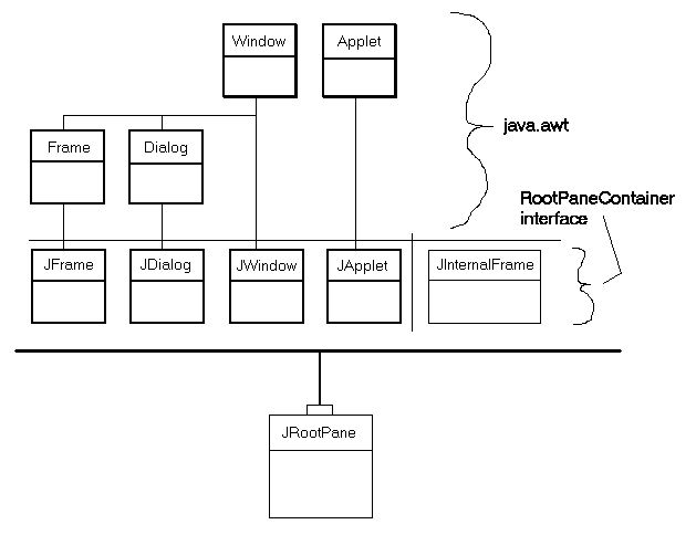
The four heavyweight JFC/Swing containers (JFrame, JDialog, JWindow, and JApplet) are shown in relation to the AWT classes they extend. These four components are the only heavyweight containers in the Swing library.
import java.awt.*;
import javax.swing.*;
public class RootExample extends JFrame
{
RootExample()
{
JRootPane root = getRootPane();
Container cp = root.getContentPane();
JMenuBar bar = new JMenuBar();
JMenu menu = new JMenu("File");
bar.add(menu);
menu.add("Open");
menu.add("Close");
setJMenuBar(bar);
cp.add(new JButton("Hello"));
pack();
setTitle("RootPane Demo...");
setVisible(true);
setSize(200,200);
setDefaultCloseOperation(JFrame.EXIT_ON_CLOSE);
}
public static void main(String[] args)
{
new RootExample();
}
}
 Reviewed by Asst. Prof. Sunita Rai
on
August 24, 2022
Rating:
Reviewed by Asst. Prof. Sunita Rai
on
August 24, 2022
Rating:


No comments: